Rich Picture delivered to Pioneering Care Partnership (PCP) in the North East.
PCP are rightly proud of the work they do and also of the importance of where they have come from. I was tasked with drawing a Rich Picture to help them get to where they want to go.
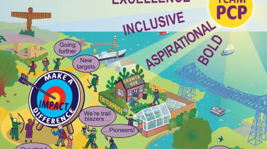
Award winning charity Pioneering Care Partnership provide health, wellbeing and learning services through many partnerships across the Northeast of England. They have grown organically since 1998 from their beginnings in Newton Aycliffe, in County Durham and have now expanded to cover much of the Northeast.
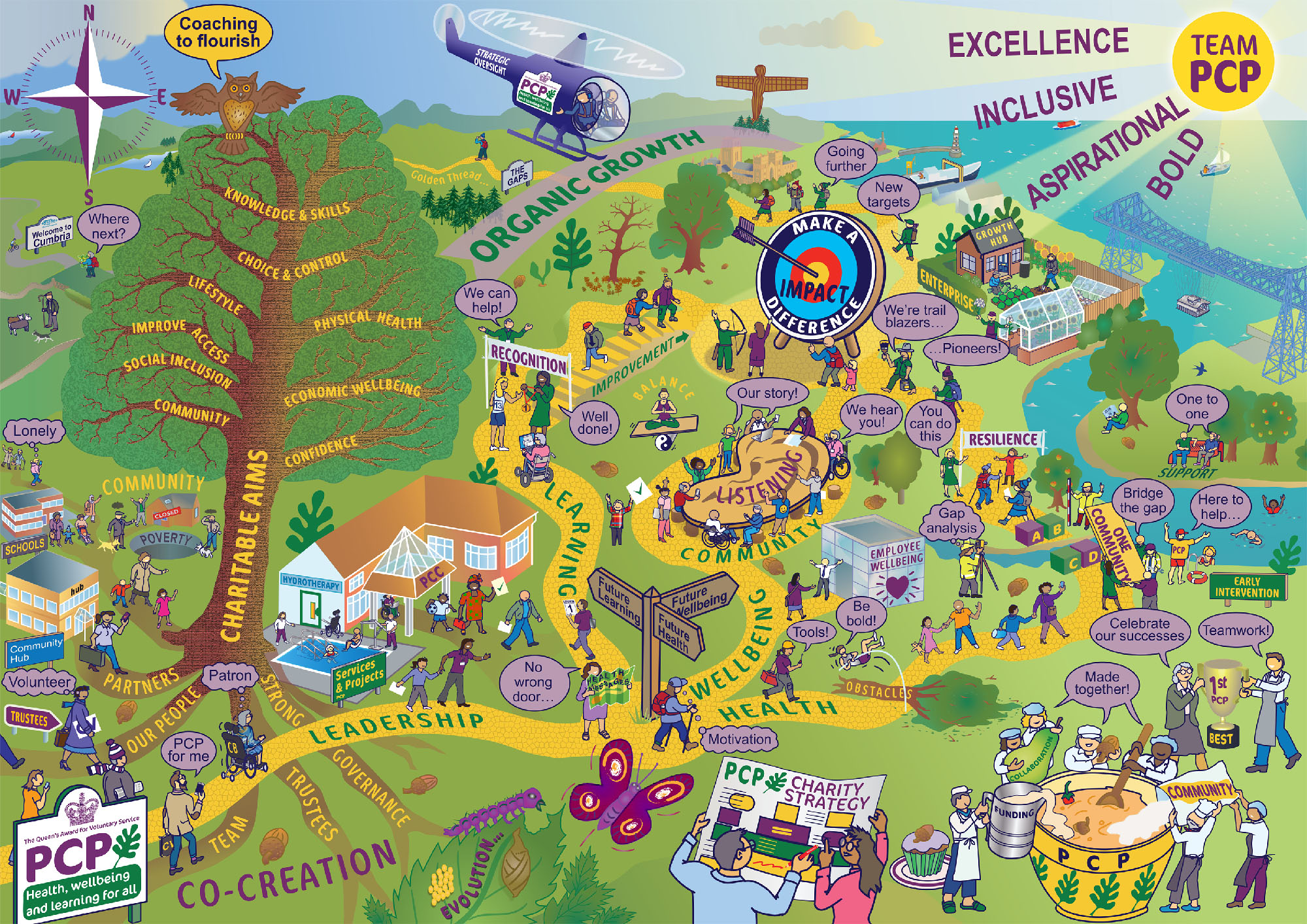
PCP Vision Rich Picture (Click for larger version)
I was invited to join them in County Durham for two all-day brainstorming sessions by Gary Hosey of EI Company. I met him for a beer and a pre-meeting the evening before in a reasonably priced hotel I found near the PCP meeting venue and discovered it was the same hotel he had held his wedding reception in several years earlier! The following morning Gary soon got everyone thinking “outside the box” with some icebreaker activities using Lego and then thinking visually with some “cutting out and sticking down” of pictures and words from magazines. I got stuck in drawing things that people wanted but couldn’t find in the stack of print. Out of this playful activity a huge amount of ideas were captured and then grouped, organised and discussed at length.
I was back the next week for a follow up meeting with a smaller group of the PCP Senior Leadership Team at a different venue and the first very rough sketches started to take shape, capturing as much of the huge amount of input that would fit. Because the oak leaf is part of their visual identity and that there was much talk of “growing organically” it planted the acorn of an idea. The three “pathways” of Health, Wellbeing and Learning suggested a walk through a forest environment, with PCP as a mighty oak tree. Having the sea to the top right, with a sun rising suggested the Northeast coastline and local landmarks like the Roker Lighthouse, Angel of The North and the Tees Transporter Bridge all appeared in the first sketch drawn in Gary’s huge, scrolling paper wall in front of the whole SLT.
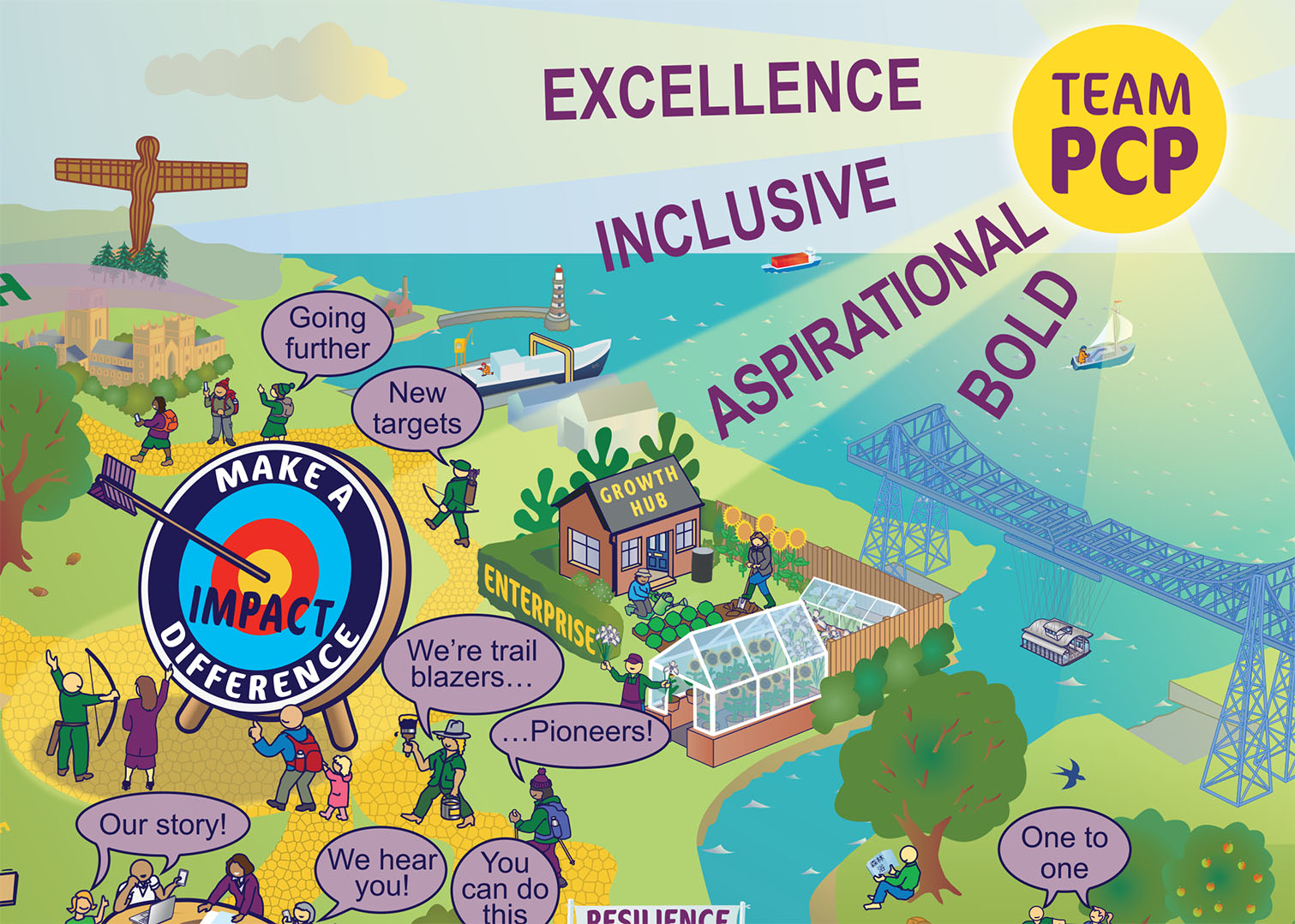
The slow progress through the pencil iterations revolved around the regular monthly SLT meetings. As you would expect PCP are a very collegiate organisation and much discussion and gathering of opinions took place over several months as the image was refined but still keeping close to the original idea.
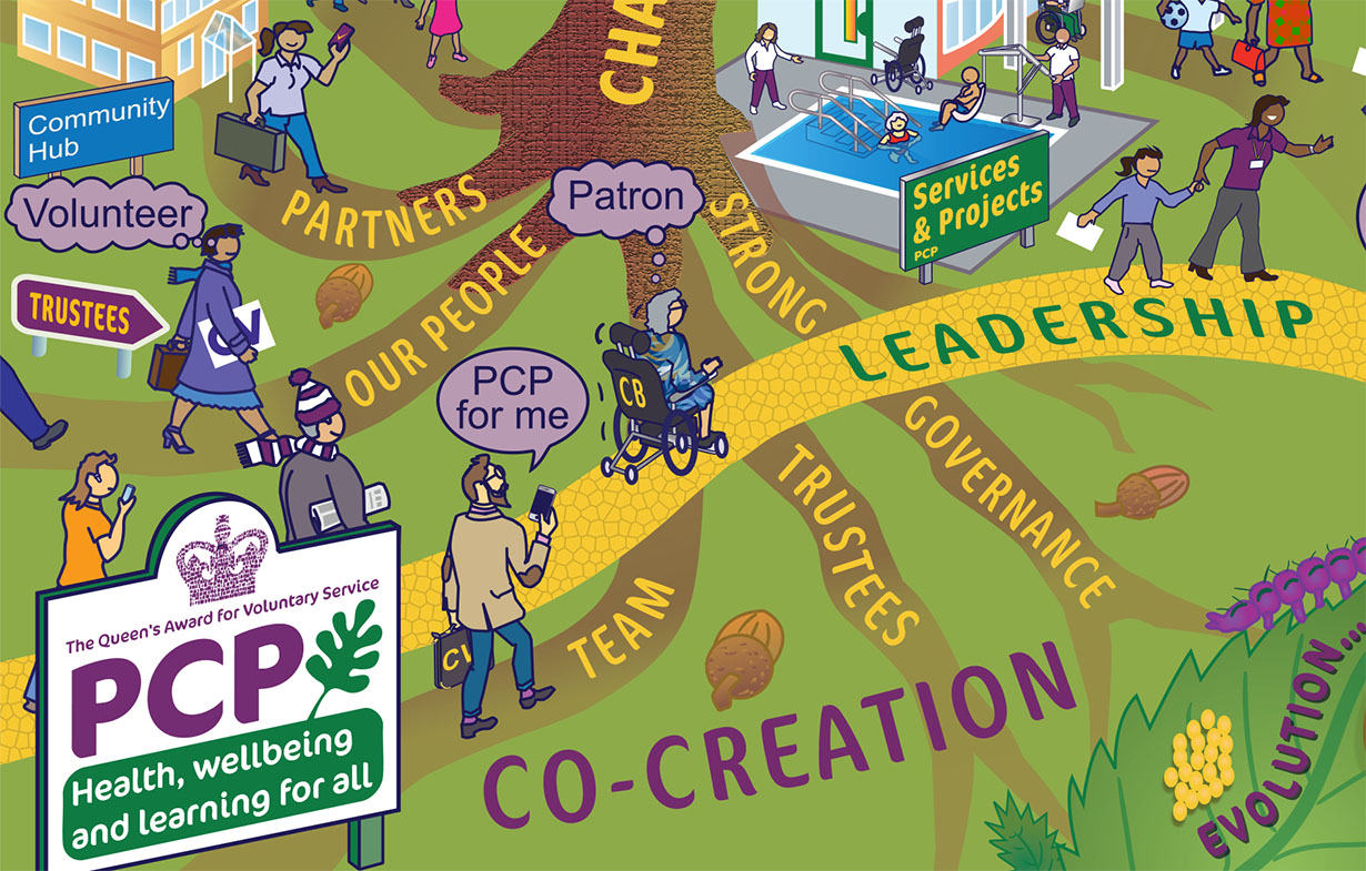
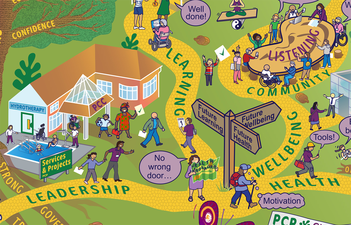
The polishing continued through the artwork stages where it was recognised that a service user in a wheelchair would not be able to progress up the metaphorical staircase labelled “improvement” so an accessible zig zag improvement path was added. It was also decided that the traditional white speech bubbles looked a bit too bright so a tint of the corporate purple was used instead. After the usual tweaks to labels and the slight repositioning of elements the artwork was finally complete about six months after the initial meeting. Not quite a record but at the longer end of the spectrum. It was worth the wait though because the collective feedback (below) was very positive and even included a “Word Cloud”…
“Hi Paul, as part of our process I asked staff to review the Rich Picture and asked them 5 questions:
-
[what one word spring to mind was asked at the staff meeting] Does the word cloud represent what people feel/felt about PCP’s Charity Strategy?
-
Are there any words missing?
-
In a few words/short sentence what do you think about the PCP Picture?
-
What is your favourite part?
-
Is there anything missing?
The word cloud to date is:

And some quotes include:
“The PCP picture is a visual representation of the heart and ethos of the organisation and highlights what attracts and drives all those who come to work for PCP and the communities and individuals at the core.”
“A lot going on, in the best way – really represents how much PCP does and how far and wide we are spread.”
“As a visual person, I appreciate visuals because they are much more descriptive than blocks of text. Every time you look at an image, you see something new, which encourages people to revisit it frequently. Additionally, visuals allow individuals to view the content from their own perspectives and interpret it in a way that is meaningful to them. This level of personal interpretation is something you don’t typically get from a word-based strategy.”
“I love it… you can look at it many times and see different things…”
“I really like the visual, the creative approach and the story telling approach.”
“It draws me in to realise extent of support both for service users and staff.”
“I think the picture is an amazing representation of what PCP does. It would be so difficult to put into words the vast amount of support fields and networks that we have. I think the picture encompasses all of these. I like the diverse range of people on the picture. These appear to be representative of the range of Clients we help.”
Many thanks again
Carol Gaskarth
Chief Executive, Pioneering Care Partnership.”
If you think your organisation could benefit from the Rich Picture process please drop me a line.
Paul Shorrock